Flutter is all about widgets, so that’s where we are going to begin out journey into coding in Flutter. This it going to be a basic intro to Flutter widgets, where we are going through what a widget is and what type of widgets that are available. You can import prebuilt widgets or build your own from scratch. We are going to take it step-by-step, but in the end you will be able to built you own widget.
What is a Flutter widget?
Flutter is a framework for building beautiful UI, which is build out of widgets. A widget describes what the view should look like and if it should change based on a state like pressing a button. When a widget’s state changes, the widget is rebuild. The smart thing is, that a view often consist of multiple widgets and then if one of the widgets in the view changes, only that specific widget has to be updated/reloaded. This makes the user experience really smooth and fast.
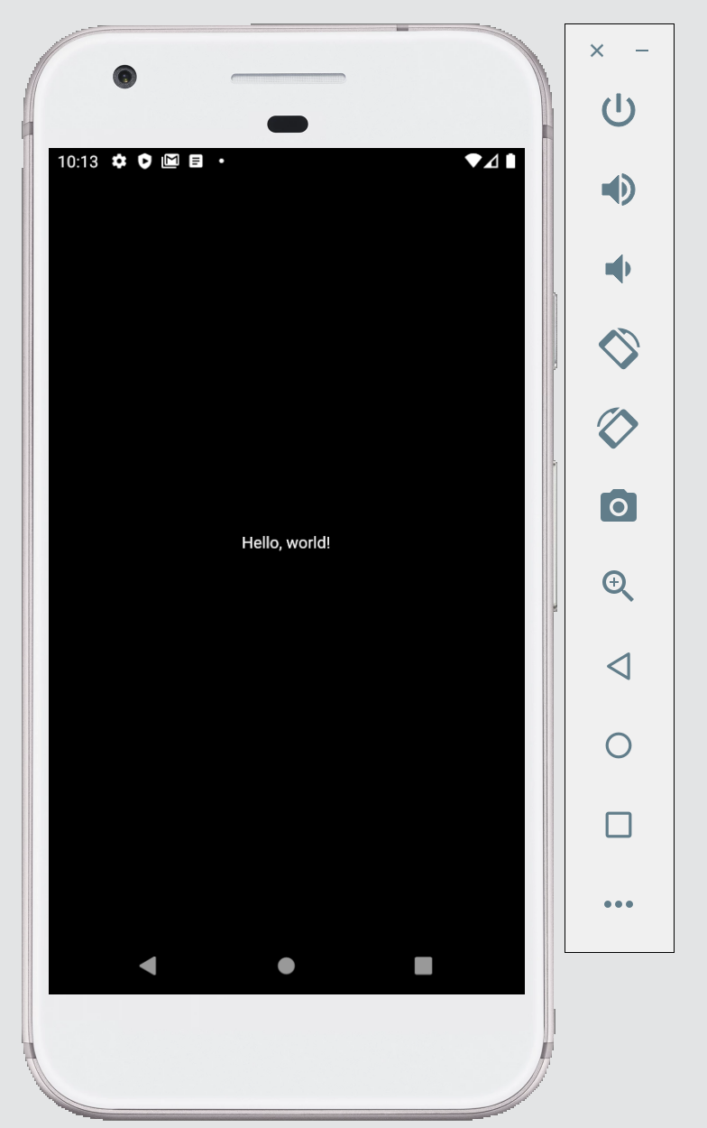
When you initiate a new Flutter project it already consist of widgets. Below is shown a simple function runApp() that calls the given widget and makes it the root of the widget tree. In the simple example the widget tree consists of two widgets, the Center widget and its child, the Text widget. It’s called a widget tree as its an easy way to understand how the widgets are related. In this case the Center widget is the main branch and then it has a child within, which is a Text widget. The Center widget tells that whatever is inside that widget has to be centered. The Text widget allows us to present a text string. We can add style to the text widget if like to make it bold or change the color or fonts etc.
dart
import 'package:flutter/material.dart';

void main() {
  runApp(
    Center(
      child: Text(
        'Hello, world!',
      ),
    ),
  );
}
Types of Flutter widgets – Stateless and Stateful
Before starting to build a widget you need to thing of the purpose of the widget. Is it going to be static or dynamic?
Static layout is not going to change after its build, like a your title or an image. You wouldn’t want your title to change based on user activity, right?
Dynamic layout is a layout that has the ability to change, like a button pressed that for instance add a product to your basket in a webshop.
These are the two different cases your should thing of, to figure out if it’s a StatelessWidget or a StatefulWidget you should use. Your views are often a StatelessWidget, like MaterialApp which is the root of your application. This is not going to change based on user activity, whereas a widget within a view might change and therefor is a StatefullWidget. With this basic introduction to Flutter widgets, we can try to build our own widget.
Build your own Flutter widget
You will come across multiple widgets and likely make you own widgets as well. When you first get a hang of it, you will really appreciate the world of widgets. Let’s take a look at how you create a widget for your Flutter app.
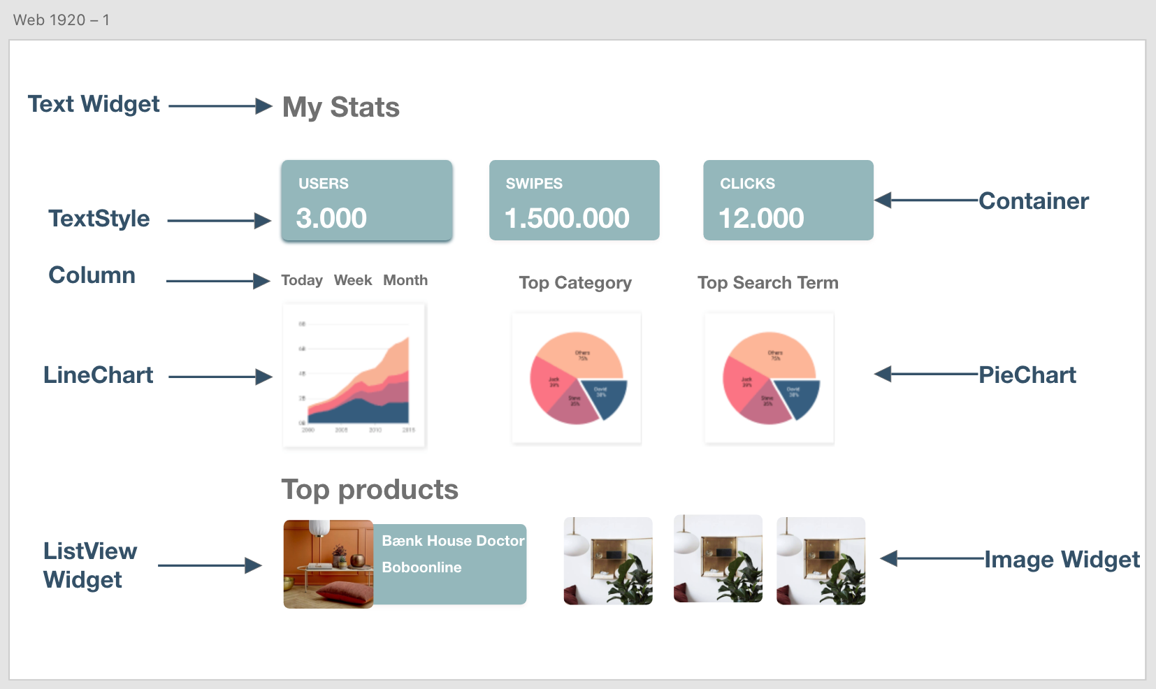
You probably want to make a beautiful view with different functionalities. To do that we can break a view into widgets. Below is a view that I would like to build. The layout is for a Flutter webpage, but as Flutter code can be used for app and web development, the same code is used. First thing is the headline. A headline is usually text, so here we will use a basic Text Widget. But what about the rest if the UI? We are going to look at the container containing Key Perfomance Indicators (KPIs) for DecorRaid. In this tutorial we are only going to focus on the UI, but I will show in a later post, how we are going to connect Flutter with a backend.
First step create a new view
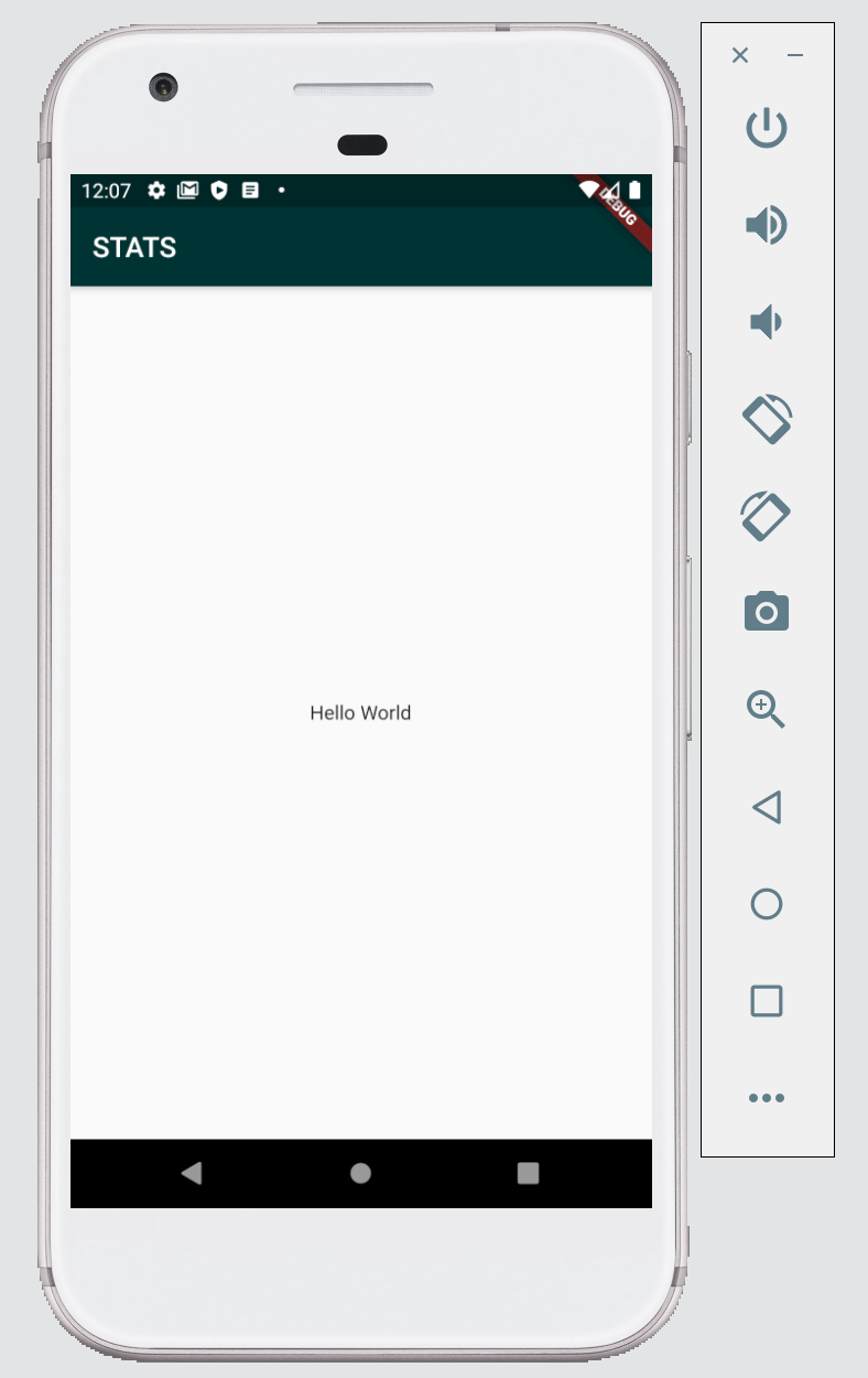
To keep an overview of the different widgets and views of your app, start by structuring you folder. You can read how to in my previous post. In the Views folder create a folder called stats. Within that folder we create a dart file called stats.view.dart. This file is where we are going to combine the different widgets that define the UI of this specific view. As the view is going to be static we will use a StatelessWidget.
Note: To show this view when running your app go to the main.dart file and add the view where it stands home:. Remember to import the view first.
stats.view.dart
import 'package:flutter/material.dart';

class StatsView extends StatelessWidget {
  @override
  Widget build(BuildContext context) {
    return Scaffold(
      appBar: AppBar(
        title: Text('STATS'),
      ),
        body: Center(
          child: Text('Hello, World!')
          )
    );
  }
}
Second Step build a StatelessWidget
Within the stats.view.dart we will define the StatsView which extends the StatelessWidget. A StatelessWidget always consist of @override wherein you build your widget. It’s within the build() method that you define your layout. If you go to the main.dart you can see that the build functions return MaterialApp which is the primary widget of your Flutter app. But as we are building a specific view within the app, we will return another widget. I have chosen the Scaffold widget, as it returns a basic UI for showing a drawer, snackBar and buttons.
Within the Scaffold widget the appBar is defined with a Text widget and within the body we can add the content for our view.
Lets build our own widget that can be displayed within the body instead of the Text widget with “Hello World”.
Third step build your own statelesswidget
To make the code organized we will create a new file in the folder lib > ui > shared > widgets called WKpiTracker.dart. I add a W in the beginning to make myself aware that it’s a shared widget. I’m going to use this widget later on in another views of my app, that’s way I add it to the shared widget folder.
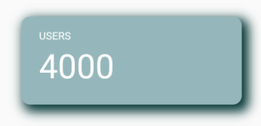
The widget is a KPI tracker that show the KPI name and the responding value. This is the widgets variable, but a variable could also be a color if you want it to display a different color depending on the view or type of KPI. This is your widget, so you decide.
WKpiTracker.dart
class WKpiTracker extends StatelessWidget {
  final String kpi;
  final String value;

  WKpiTracker({this.kpi, this.value});

  @override
  Widget build(BuildContext context) {
    return Container(
The variables that you want to change depending on where you use the widget, is defined in the beginning of your widget. We use final as it make it possible for us to define the variable in our class or function. After final we add what kind of variable is acceptable. It can be a String (text), Color or bool (true/false) etc. In this example we a using String. Next you need to define what values that needs to be gathered when calling to WKpiTracker. This we can do by writing
WKpiTracker({this.kpi, this.value});
With the variables ready, we can build the UI.
Build the UI of your Flutter widget
First, we are building the box which is called a Container. Within the container you can customize the layout. If you have any questions to the code or styling then please add a comment below. I’m not going to go into details about the styling. But here you have the code and then you can copy it and change the format as you desire.
WKpiTracker.dart
import 'package:flutter/material.dart';
import 'package:DecorRaid_Admin/ui/shared/utils/appTheme.dart';

class WKpiTracker extends StatelessWidget {
  final String kpi;
  final String value;

  WKpiTracker({this.kpi, this.value});

  @override
  Widget build(BuildContext context) {
    return Container(
      alignment: Alignment.centerLeft,
      width: 250.0,
      height: 100.0,
      padding: const EdgeInsets.fromLTRB(20, 0, 20, 0),
      decoration: BoxDecoration(
          borderRadius: BorderRadius.circular(10.0),
          color: AppTheme.colors.dustyTurquoise,
          boxShadow: [
            BoxShadow(
              color: AppTheme.colors.dustyBlue,
              blurRadius: 10.0, // has the effect of softening the shadow
              spreadRadius: 3.0, // has the effect of extending the shadow
              offset: Offset(
                5.0, // horizontal, move right 5
                5.0, // vertical, move down 5
              ),
            )
          ],
      ),
    );
  }
}
This code results in a turquoise box with round corners and a box shadow. Now it's time to add some text. To do that we a going to add a child to the container. Add the below code after the closing bracket of BoxDecoration. The child makes it possible for us to add text inside the box. As we wants to add two Text widgets within the child, we add children to that child.
WKpiTracker.dart
child: Column(
        children: [
          Padding(
            padding: const EdgeInsets.symmetric(
              horizontal: 0, vertical: 15),
              child: Column(
                 crossAxisAlignment: CrossAxisAlignment.start,
                        children: [
                          Text(kpi,
                              style: TextStyle(
                              color: AppTheme.colors.white,
                              fontSize: 12.0
                              ),
                              ),
                          Padding(padding: const EdgeInsets.fromLTRB(0, 0, 0, 6),),
                          Text(value,
                              style: TextStyle(
                                color: AppTheme.colors.white,
                                fontSize: 38.0)
                                ),
                        ],
                      ),
                    )
          ],
        )
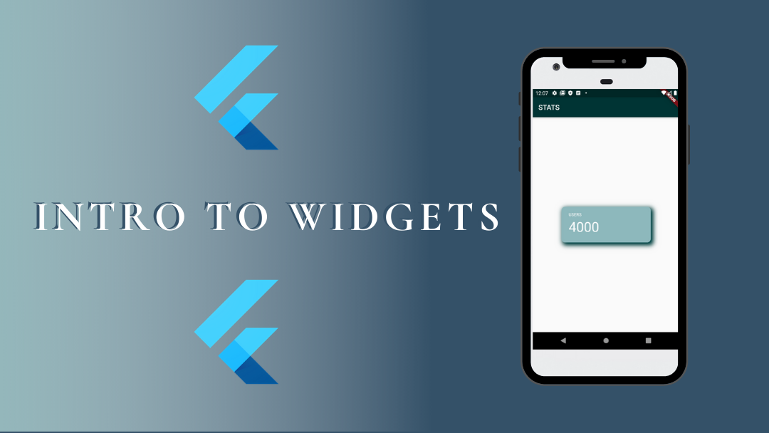
Now you have your widget ready but before you can see it in action you need to add it to your view. So, go back to stats.view.dart and instead of the Text widget in your body you add the WKpiTracker widget you just build. To be able to use your new widget you have to remember to import it. And, remember to add your variables. Pretty cool you have build your first Flutter widget!
stats.view.dart
import 'package:flutter/material.dart';
import 'package:DecorRaid_Admin/ui/shared/widgets/WKpiTracker.dart';

class StatsView extends StatelessWidget {
  @override
  Widget build(BuildContext context) {
    return Scaffold(
      appBar: AppBar(
        title: Text('STATS'),
      ),
        body: Center(
          child: WKpiTracker(
            kpi: 'USERS',
            value: '4000',
          )
          )
    );
  }
}
Add the widget as many times as you like, remember you need to add children to the child, if you want to add mulitple widgets to the body.
I hope this Intro to Flutter widgets helped you to understand widgets better and you feel comfortable with trying to build your own Flutter widget. If you have any questions or comments please reach out in the comments below.
Happy coding 👩🏽💻
